
In Other Words
Editorial Design for a Non-Profit
Year:
2024
Category:
Editorial & Layout Design
Client:
Wycliffe Canada

Project Overview
Wycliffe Canada is a non-profit organization that partners with global communities to translate the Bible into their heart language, funding and supporting the translation process, literacy, engagement with Scripture and capacity building. I love Wycliffe’s commitment to communicating in ways that are most meaningfully received by others.
In Other Words is a bi-annual newsletter/magazine hybrid that seeks to give a snapshot into the stories of transformed communities and lives. Their desire was to engage viewers beyond a skim read, and emphasize imagery. I was excited to learn from these stories and tackle this engagement gap.
Exploration
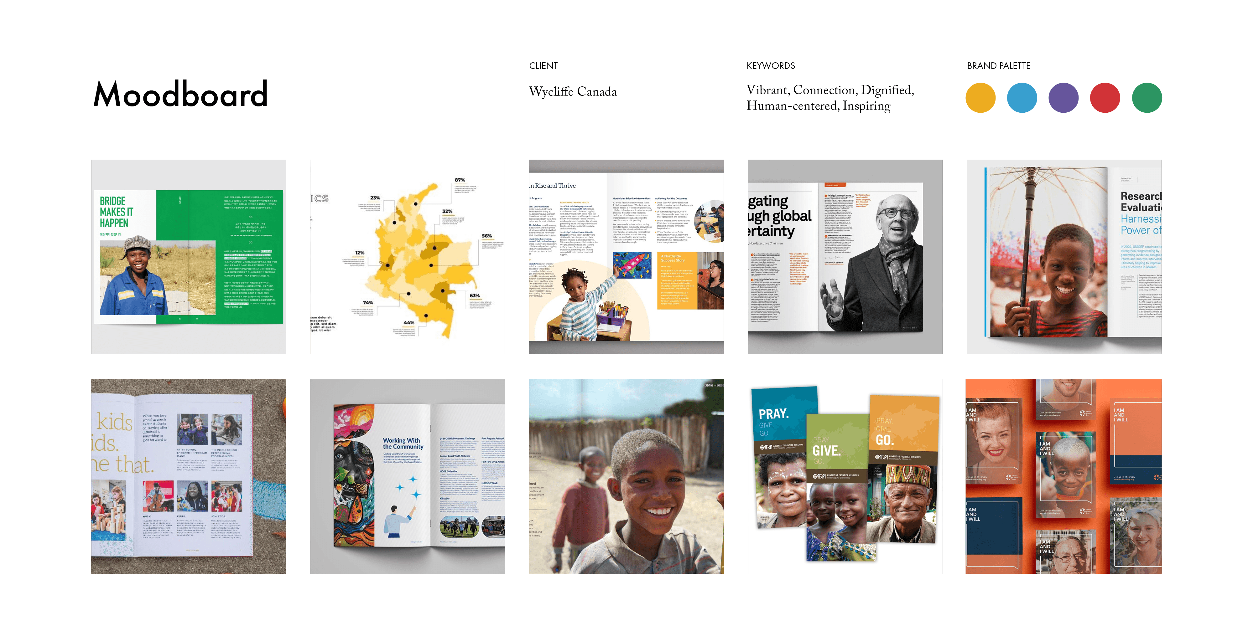
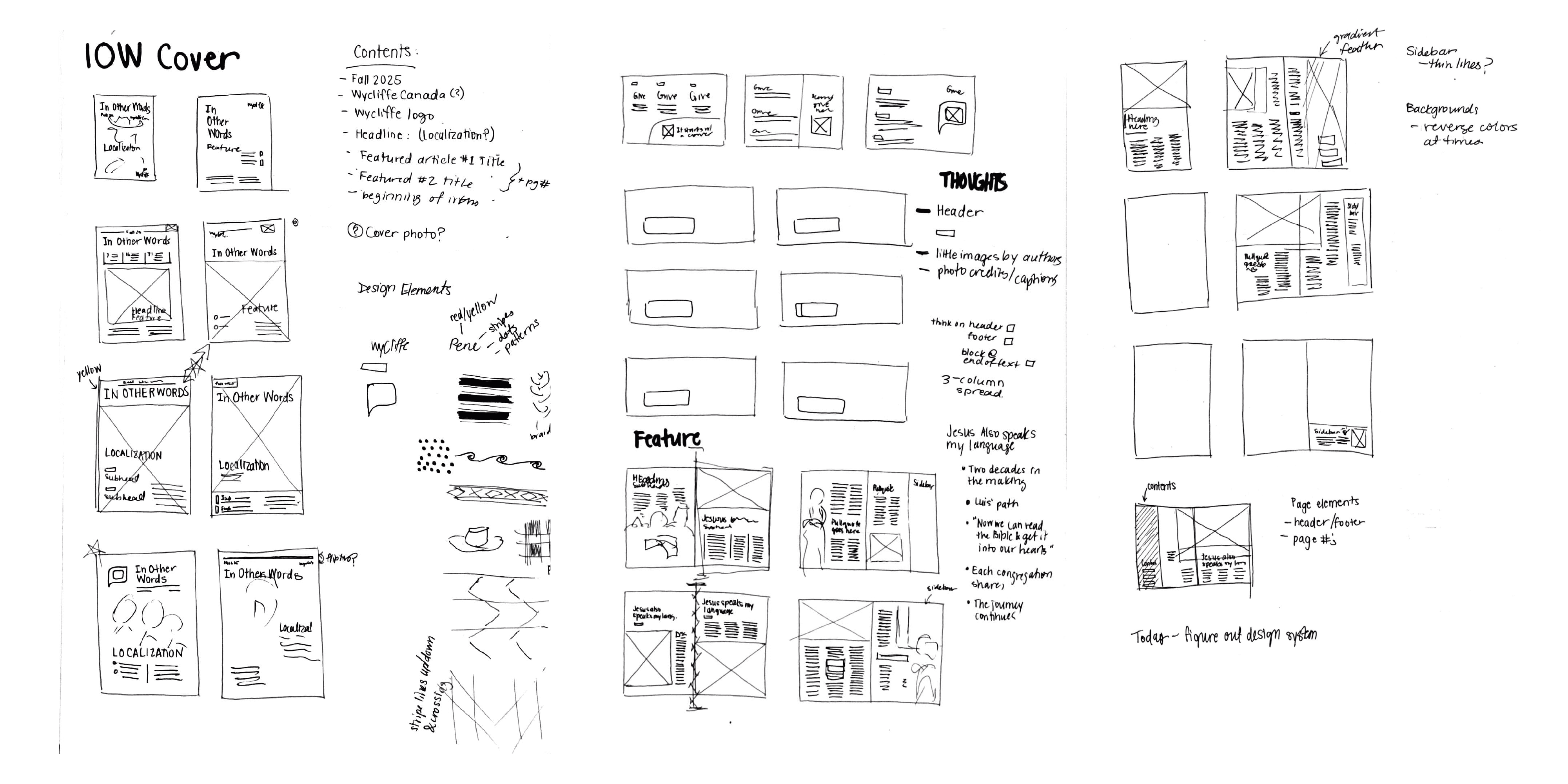
The process began with research. Paging through old issues, clarifying priorities with the communications team and getting to know their audience of readers – who seek connection, impact, and to learn what they can’t know by going themselves. Wycliffe believes deeply in reciprocity and so dignified representation was of high value. In initial sketches, I was tasked with balancing margin for the written text (within 16-pages), while creating a hierarchy that took viewers on the journey from images, to headlines, to the story itself – visuals that spark curiosity.
From Ideation to Creation
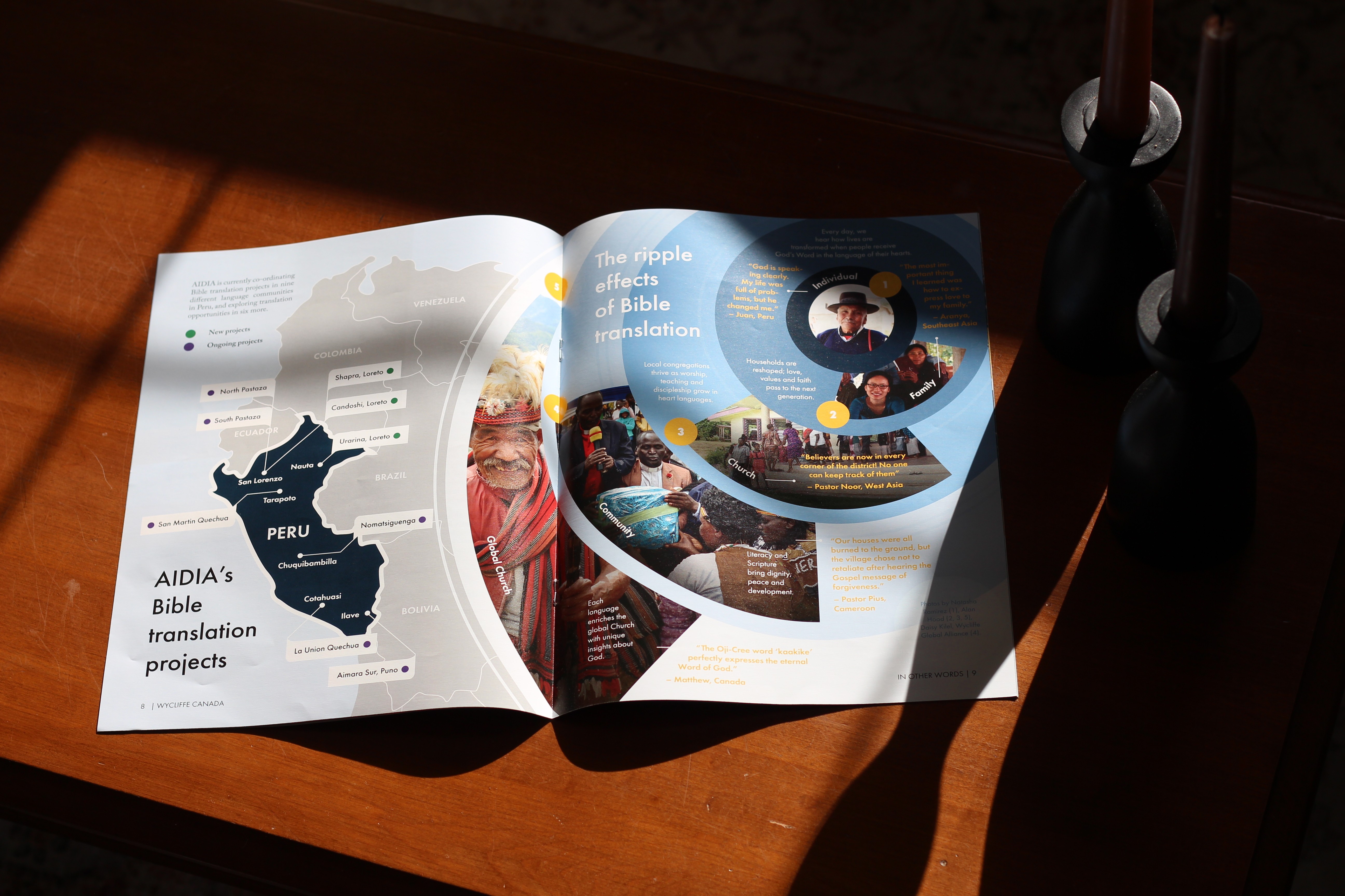
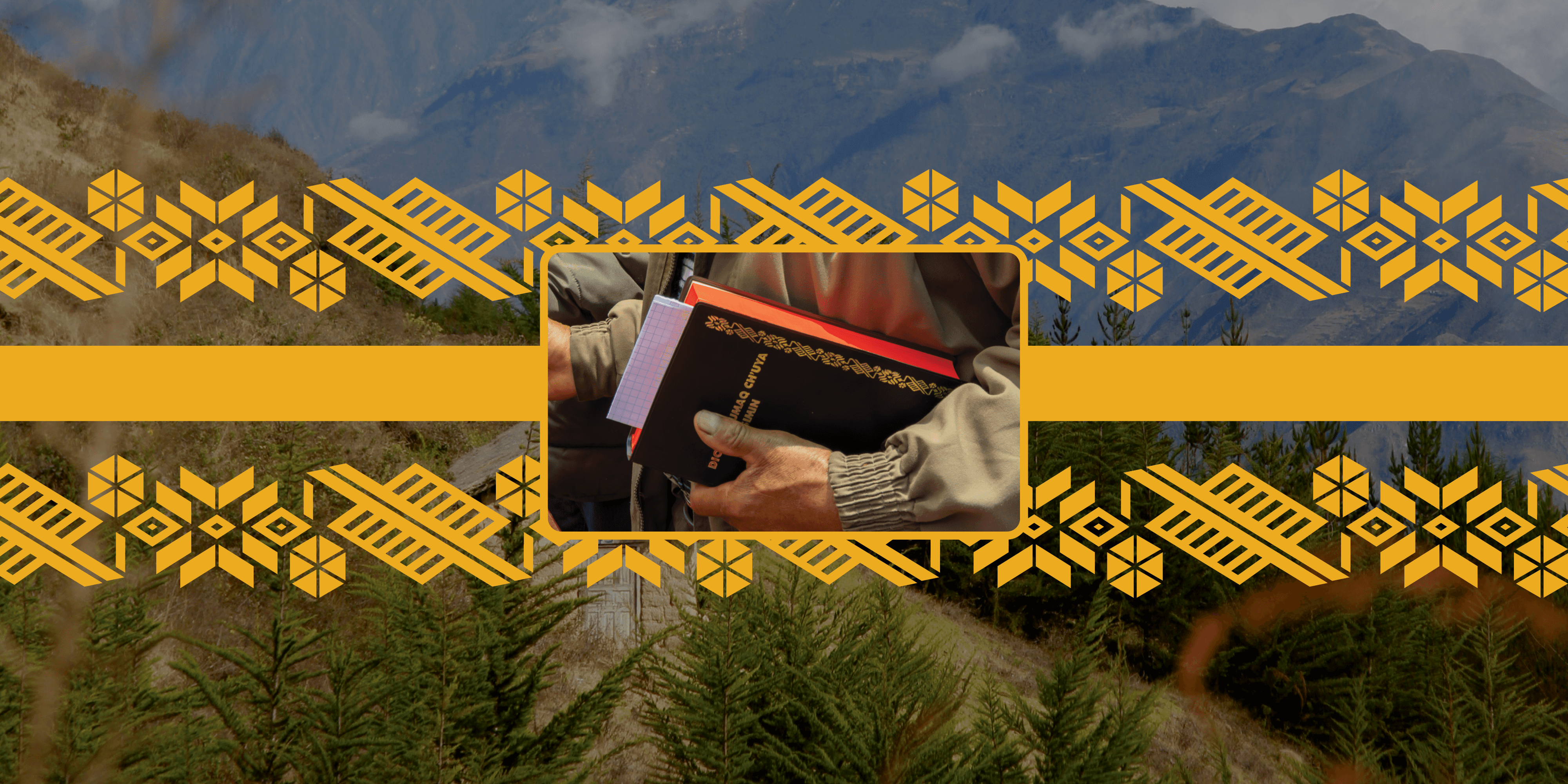
“Wycliffe Gold” was prioritized to link brand recognition to the organization, and to alert viewers of important supporting content. I noticed that one of the translated Bibles of the Eastern Apurimac Quechuan people of Peru had a beautiful design often used in textiles on the cover. Converting this into a design element used throughout the issue connected together the headline stories based within this people group.
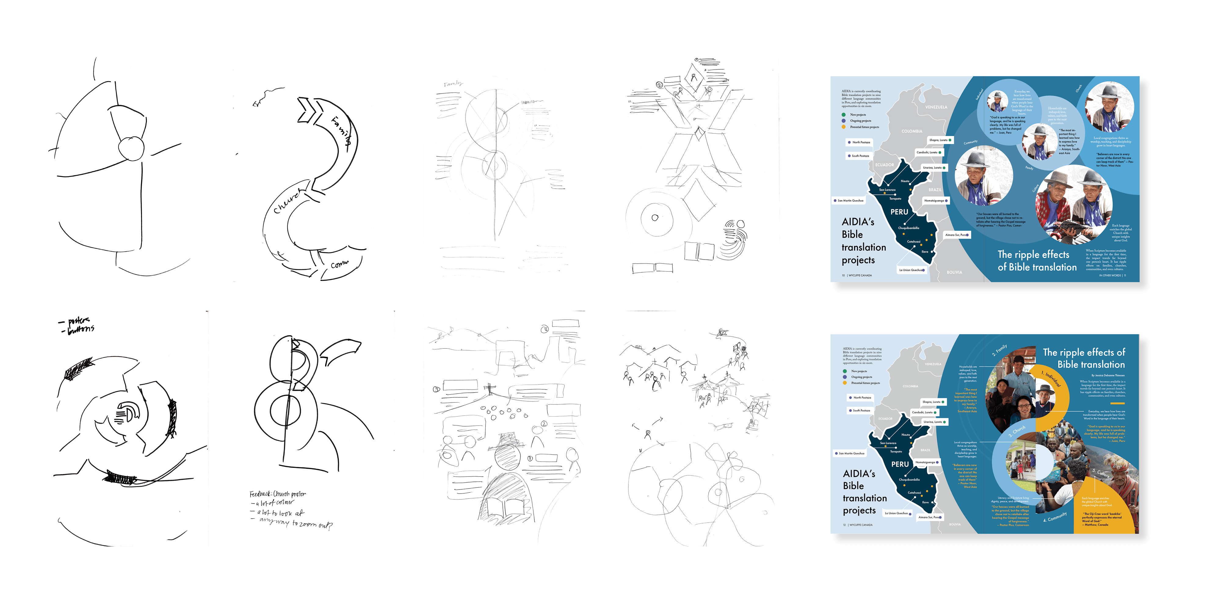
I wanted to craft graphics that provided a sense of place – whether through a clearly labelled map or to grasp the spreading outward impact of translation.
Pulling together an infographic that visually told the story of the expansion of Bible translation. Multiple pathways were explored before deciding a visual "ripple" best showcased its dissemination.
Further, showcasing images that capture emotion was a must in forging the connection between the events that were featured in the story and the at-home reader.
A Vision Realized
Wycliffe Canada sought to connect their audiences with some of the amazing stories that have come through generous funding. The hope was to have an informative and visually engaging editorial piece that was warm and invited connection. The result? An issue that is aligned with their brand in function, informative in nature, and is image-forward in hierarchy.
Collaboration
This project was a intersection of writers, photographers, copy editors, commercial printers and communication specialists.
Deliverables
16-page booklet
Online version